Analysis Of Professional Front Pages
Metal Hammer - Bullet For My Valentine - Front Cover Analysis
Denotation
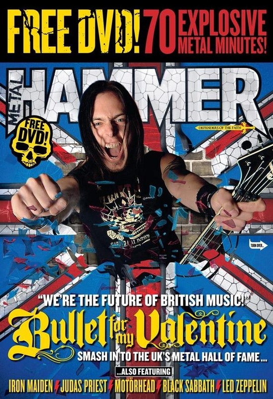
The magazine cover consists of a colour photograph for a male holding a guitar looking directly at the camera. It is a medium shot showing his face and arms. He is photo-shopped onto a background of a Union Jack with t a smashed glass effect; the subject is places directly in the hole of the glass. Behind the hole and ‘smashed glass’ is a brown brick wall. Behind the Man is the Metal Hammer Masthead, just below the masthead is a cover line/promotional add of a yellow scull with the writing ‘FREE DVD’ on it. Above the masthead is a large selling line in yellow and red font with a black text box. Below the man is the main cover line in white and yellow.
Masthead
The Metal Hammer masthead is very distinctive: It is one of a few music magazines that regularly change’s their masthead colour scheme to suit the artists on its front cover, this shows how versatile Kerrang Magazine is and implies that they host a whole range of Bands / Artists. In this edition the Masthead is in white and outlined with charcoal grey. It uses a bold sans serif font and is written all in capitals, this connotes that’s it is a modern magazine and features up to date bands/artists. The layout of the mast head is it says ‘Hammer’ and the ‘Metal’ is written inside the left leg of the ‘H’. The ‘metal’ looks like it is engraved or written with chalk giving off a rebellious non conformist theme. The outside legs of the ‘H’ and ‘R’ in ‘Hammer’ is pointed this could relate back to the word hammer – looking like a sledge hammer. Also the sharp edges suggest an edgy/aggressive genre of music with sharp vocals and fast rhythmic drum beats. The masthead has the word ‘Metal’ in it implies that this is the main genre of music featured in this magazine.
Character
The cover photograph is of ‘Matt Turk’ The Lead singer of The Band ‘Bullet For My Valentine’ who are the Main Cover line of This Article of Metal Hammer Magazine.
Composition
He is doing a very common ‘Rock Star’ Pose. Mouth wide open exposing his teeth and tongue, fist clenched and his guitar is also displayed adding to the ‘Rock Star’ Theme.
Costume
The background takes up the majority of the cover page making it hard to see what he is wearing. However we can see he is wearing a printed, black, sleeveless shirt. This exposes his left arm, allowing the audience to see his many bracelets. He does not seem to be dressed up in any sort of costume for the photograph showing that he is a casual character.
NVC
His non verbal communication is also very ‘Rock star’ giving of this ‘Bad Boy’ idea. He appears very confident because he looks directly at the camera.
Lighting
The Photograph of Matt Tuck looks well lit (High-key), but the picture looks heavily photo-shopped with 2 different back grounds that may have likely not been in the original photo shoot.
Setting
The created setting is of a man ‘breaking-out’ of the ‘Blocks’ (the brick wall background) into a Great Britain flag. This implies that The Band has broken away from their small band-past, into a well known British band.
Cover Lines:
The main cover line relates to the photograph “ ‘We are the future of British music’ – Bullet For My Valentine – Smash into The UK’s Metal Hall of Fame”. This is relating to the fact that Bullet For My Valentine are one of the best Selling Metal Bands from the UK. The ‘We are the future of British music’ indicates that The Band don’t look to stop any time soon and might want to even expand.There isn't really another cover line but it does have 2 selling lines/Advertisement. Right at the Bottom of the magazine says ‘Also featuring – Iron Maiden – Judas Priest – Motor Head – Black Sabbath – Led Zepplin”. They used the very popular Bands like Iron Maiden and Judas Priest on the cover page mainly because of their popularity; they know that many of their audience might really like them and featuring big name bands in your magazine is one of the main reasons people buy a music magazine, to ‘read-up’ on their favourite bands/ artists. The over cover line/Selling point was “FREE DVD! -70 Explosive metal minutes”, This makes their audience feel like they are getting more for their money, instead of just articles and posters they get a DVD with over and hour’s worth of content, this persuades them to buy the magazine.
Target Audience
The Metal Hammer Target audience seems to be for all ages. I would say this because of the musicians featured and promoted in the magazine are both young and old. Also it seems to be people who genuinely have a passion for rock music with the free DVD sows the audience that its more about the music than the image. This magazine is for anyone who wants to know all the latest news about their favourite bands old and new, this could be for all ages because rock music is enjoyed by every age group.
Kerrang - The Blackout - Front Cover Analysis
Denotation
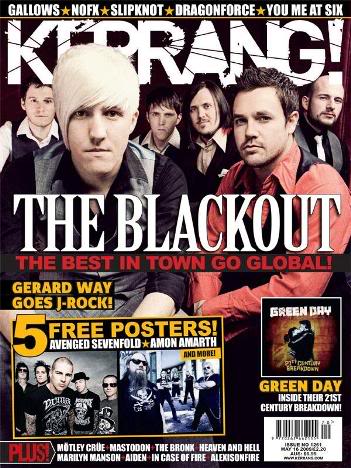
The magazine cover consists of a colour photograph of a group of 6 males looking directly at the camera. The men are arranged as 2 males are closer to the camera and the other 4 are in the background. It is a medium shot showing all the faces of each man. The 2 men seem to be sitting on some sort of stool while the men at the background stood; they are placed in front of a red background that fades down into black. Behind the group is the ‘Kerrang’ masthead. In front the group is the main cover line in white and red with a black text box. Below main cover line is a yellow outlined picture of 2 posters of bands that you can find in the magazine, above the picture says ‘5 Free Posters!’ in yellow and ‘ AVENGED SEVENFOLD – AMON AMARTH’ in white. On the bottom right hand side of the magazine is a picture of a ‘Green Day’ Album. Below are the barcode, dateline and edition price. Right at the top of the magazine is the selling line in white with a black text box. Each band name is separated by a gold star.
Masthead
The Kerrang is very unique: in this edition is just White. Kerrang magazine is one of the few magazines to regularly change their masthead colour scheme to suit the artists on its front cover; this shows how versatile Kerrang Magazine is and implies that they host a whole range of Bands / Artists. It uses a Bold Sans serif Font in all capital letters. This implies that too their target audience is bold and loud and are into quite aggressive music like rock. Each word in the masthead has thin slashes across it which could also imply that the magazines intent is to produces raw content as well as edgy music. The Masthead also features an exclamation mark on it; unlike other magazines this has connotations with loud music. The word Kerrang has a sort of ‘bang’ to it too this tells the audience that it is a music built magazine.
Character
The cover photograph is of The Welsh Band ‘The Blackout’
Composition
The Band in arranged as: 2 men are seated closer to the camera, while the 4 men are stood behind. All the men are looking directly at the camera with a ‘straight face’. They are also stood confident, seated straight and dressed smart this shows that the band is serious about their music.
Costume
The Men are dressed in Smart shirts and waist coats. All the men have different combinations of colours this could imply that each member is different and has a different role in the band. Also it could be a way of breaking away from the stereotype ‘boy band’ look, where each member is dressed exactly the same. This smart look also shows that the band is very professional and is serious about their Jobs.
Nvc
The bands Non- Verbal Communication is very professional and straight forward. There is no clear facial expression and their body language very upright. All looking directly at the camera shows confidence and professionalism.
Lighting
The lighting is high-key but edited onto a dark background.
Setting
There is no real setting because the band seemed to be taken in a plain black background or have been edited onto one.
Cover Lines
The Main Cover Line Relates to the Main photograph that says “The Best in Town Go Global”. This is referring to the fact that ‘The Blackout’ is becoming a ‘World Wide Band’ expanding their usual tour of Great Britain to America and some parts of Europe. This is why they might have chosen to dress this ‘smart’ as a sign of ‘Growing Up’ from a little Welsh band to a Global Phenomenon. The other Cover lines mainly just advertisement for people to buy the magazine, “5 free posters – Avenged Sevenfold – Amon Amarth”. They used the very popular Band Avenged Sevenfold on the cover page mainly because of their popularity; they know that many of their audience might really like them and offering posters of people favourite band in a great strategy to get people to purchase your magazine. The over cover line was “Green Day – Inside their 21st Century Breakdown” Another very Popular band, this time Kerrang are offering a free album, defiantly a great way to get people to buy your magazine. This shows that Kerrang is heavily influenced by rock music only because no other genre is mentioned in any of their cover lines in this article.
Target Audience
The target audience seems to be more for teenagers to youngish adults (ages of 14-35). I would say this because of the musicians featured and promoted in the magazine are quite young also elderly people are less likely to be thrilled by posters. Also it seems to be people who genuinely have a passion for rock music and want to know all the latest news about their favourite bands, which are more likely to be younger people because older people tend to be more interested in current events than music and celebrity gossip.
Kerrang - Asking Alexandria - Front Cover Analysis
Denotation
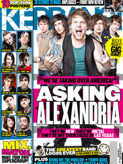
The magazine cover consists of mainly a photograph of 5 males. It is a long shot showing their full bodies, they are standing all at different angles towards the camera, the man in the middle is closest while the men on the edge of the 5 are furthest away. They are photo-shopped onto a white background with grey lines coming from the lower regions of the men. Behind the men is the Kerrang Masthead. On the left of the group is a row of 10 small photographs with the name of the bands each person is from. In front of the group of men is a large cover line (main cover line) in white and black witch a pink text box. At the bottom of the magazine is another cover line instead in white and yellow with a dark grey text box. Right at the top of the magazine is a selling line in Turquoise and white with a back text box.
Masthead
The Kerrang is very unique: in this edition turquoise and white. Kerrang magazine is one of the few magazines to regularly change their masthead colour scheme to suit the artists on its front cover this shows how versatile Kerrang Magazine is and implies that they host a whole range of Bands / Artists. It uses a Bold Sans serif Font in all capital letters. This implies that too their target audience is bold and loud and are into quite aggressive music like rock. Each word in the masthead has thin slashes across it which could also imply that the magazines intent is to produces raw content as well as edgy music. The Masthead also features an exclamation mark on it, unlike other magazines this has connotations with loud music. The word Kerrang has a sort of ‘bang’ to it too this tells the audience that it is a music built magazine.
Character
The cover photograph is of a New British up and coming Band ‘Asking Alexandria’
Composition:
The main man (lead singer – closest to the camera) is posed with the typical rock ‘Devil’s horn’ dose, with is tongue shown. His pose and body language shows that he is confident and doesn’t care about how people perceive him. Very rock centred. The other guys seem to just be standing there been quite natural with their hands in their pockets giving off this ‘cool and relaxed’ look about them.
Costume
Their clothing is very casual, although the lead man might be wearing a waist coat he is wearing just a green singlet underneath. They are all dressed in jeans, some even wearing jeans jackets and t-shirts / singlets. The majority of the guys have visible tattoos and this gives off a punk feel, the costumes does not look chosen specifically for the photo shoot giving off this casual vibe to the audience.
Nvc
The non-verbal communication is also very fun and casual, the mouth open smile and the devil’s horn which adds to the feel, the guys behind too have their hands in their pockets giving of a laid back persona.
Lighting
The lighting is high key; the photograph looks to have been taken in a studio.
Setting
There is no real setting because the band seemed to be taken in a plain white background or have been edited onto one.
Cover Lines
The main cover line says “’We’re taking over America’ – ASKING ALEXANDRIA – They’re new they’re metal they’re off their faces in Las Vagas” This is referring to have quickly the band became really popular and referring to the fact that the band are quite popular in America and currently on tour. The ‘they’re new they’re metal’ part is the editors sort of introducing the band to readers who might not know them yet as well as exaggerate the fact that they ‘blew up so quick’. All the other cover lines are about other rock bands featured in the magazine for promotional purposes as well. There is a column of the front page of the magazine saying ’10 Top Punk posters’ with the pictures of them and their bands name below to persuade people to purchase. With all the other bands featured it tells the audience that they focus on not just a few bands and are versatile to cater for your favourite band or bands as well as suggest new bands to listen to.
Target Audience
The target audience seems to be more for teenagers to youngish adults (ages of 14-35). I would say this because of the musicians featured and promoted in the magazine are quite young also elderly people are less likely to be thrilled by posters. Also it seems to be people who genuinely have a passion for rock music and want to know all the latest news about their favourite bands, which are more likely to be younger people because older people tend to be more interested in current events than music and celebrity gossip.
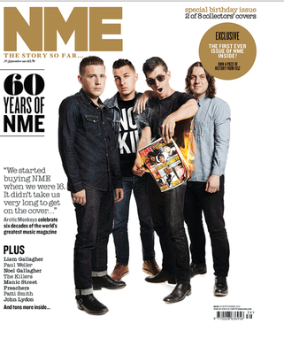
NME - Arctic Monkeys 1st October 2012
Denotation:
The magazine font page is a photograph in of four men all all having a direct address (at the camera). It is a group long shot showing their whole body from head to toe. A male has set a magazine alight, with a cigarette lighter he is also holding with his right hand. Above the men is the NME masthead in gold, and to the right of them are three separate cover-lines written in black. The photographed group’s name is written in grey ‘Arctic Monkeys’. There is also a dateline and price of the magazine underneath the masthead in black. There are two selling lines, one in gold and the other in black and gold. And the puff is positioned just below the selling line of late and is written in black and white in a gold circle. In the bottom left corner of the magazine, a bar code is positioned with another dateline above it. Also the magazines price in different currencies to create an international feel.
Masthead:
NME’S masthead is easily recognizable: Gold and written in a bold, calssic Sans Serif font. In the font used there is a clear gap between each letters. The letters ‘NME’ stand for ‘New Musical Express’ which could mean that NME specialize in new music or they focus on finding new music. This implies that the magazine is current, modern and is a showcase of new music. But this could also suggest they may include non music Items, with a magazine like ‘Base’ can be quite limiting as everyone will expect just music content. ‘NME’ could give the Editors the freedom to try new – non music projects.
Character:
The Cover photograph is of the successful and pioneers of English music, English band ‘Arctic Monkeys’.
Composition:
They are posed in a very aggressive but conventional way, despite the the fact one of them is burning a magazine, they are stood in a curved ‘semi-circle position’ which is the ‘go to’ group shot. Their pose, body language and clothing connote and support’s their rebellious persona. They are made to look like they are in control of the situation of the burning magazine – this makes them seem not just confident but also very cool/defiant – playing on the ‘don’t play with fire’ ideas.
Costume:
They are sort of dressed like modern punks or rebels, representing a very negative attitude. Their clothing is dark, showing there is a mystery around them and they don’t want to give too much away of whom they are. Their clothing has been chosen very carefully to appeal to a certain target audience of the magazine, who are most likely to be teenagers and young adults, both male and female. What appears to be the lead man is wearing sun glasses connotations with mystery and a hidden identity appeals to both sexes.
NVC:
The one burning the magazine has his mouth open like he is trying to gain our attention or he is showing us that the magazine on fire is quite hot to hold. There non-verbal communication has a sort of attitude to it like they don’t care. This is supported by the facial expressions of the rest of the band, they all have this ‘black’ ‘expressionless’ facial expression on their face, suggesting their lead band mate’s action (burning the magazine) isn’t a big deal to them.
Lighting:
The lighting is very high-key as they are all lit up well. You could tell this image was taken in the studio with a professional lighting system as all parts of the characters faces are well and evenly lit.
Setting:
There is little setting, there is a white background with the intension to make the band the main point of focus and stand out more – focussing on the actions of the lead band mate (burning the magazine).
Cover-lines:
The main cover-line relating to the photograph says: “60 YEARS OF NME” which is making a reference to how long the magazine has been running – this supports the gold theme normally associated with celebration. There is also another cover-line that can relate to the photograph which says: “Arctic Monkey celebrates six decades of the world’s greatest music magazine” which is the title of the band being photographed. It may be referring to the band that has been in and on the magazine ever since they broke out into the mainstream. It also makes reference to the magazine celebrating their 60th birthday as a music magazine and what bands make of being in the magazine and on its front page. You can see this by another cover-line which says: “We started buying NME when we were 16. It didn’t take us very long to get on the front cover…” which is showing part of an interview with the band and what they made of their first front page for NME. It also shows the way NME introduce new bands with them only being young adults when they got onto the front cover of the magazine. Then the magazine lists some other artists’ names below this who are also talking about their experiences with NME (Liam Gallagher – Paul Walker – Noel Gallagher – The Killers – Manic Street – Preachers – Paul Smith – John Lydon).
Target Audience:
The target audience for NME is likely to be a variety of ages from young teenagers right up to adults maybe let’s say in their late 40’s. This I because it seems like a magazine that will stick with you when you buy your first edition of it. A factor to consider is that ageing adults may continue to purchase this magazine, maybe to reminisce about their youth or, it may stop them from feeling like they’re growing old and buy it keep up with new. Also it is expected that young people would be attracted to this magazine as they like to know what and who is the next big thing, this magazine is likely to help people find these artists.
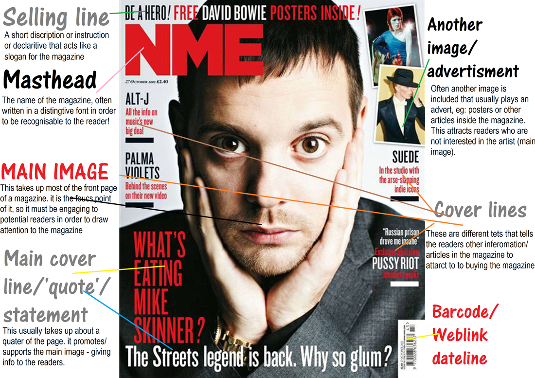
Conventions diagrams