Analysis Of Professional Contents Pages
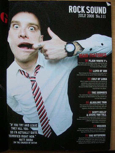
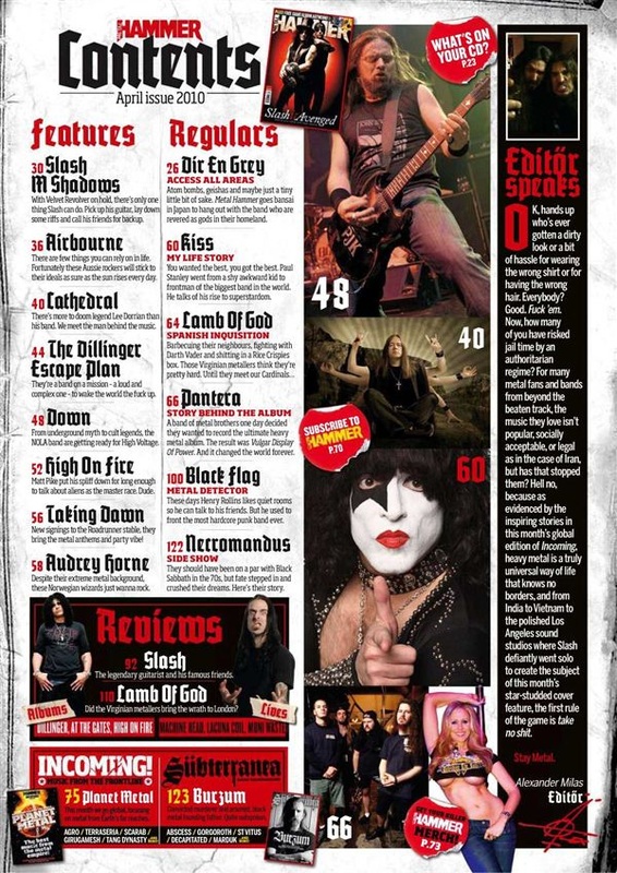
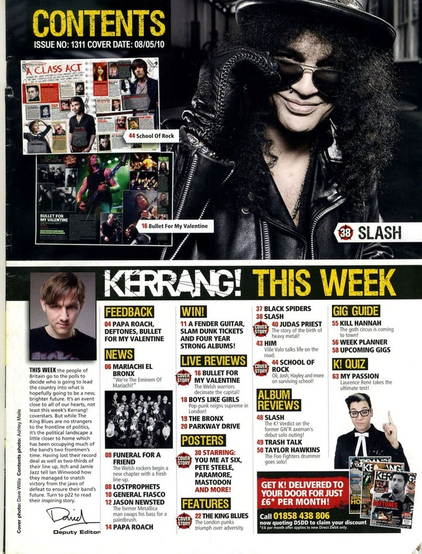
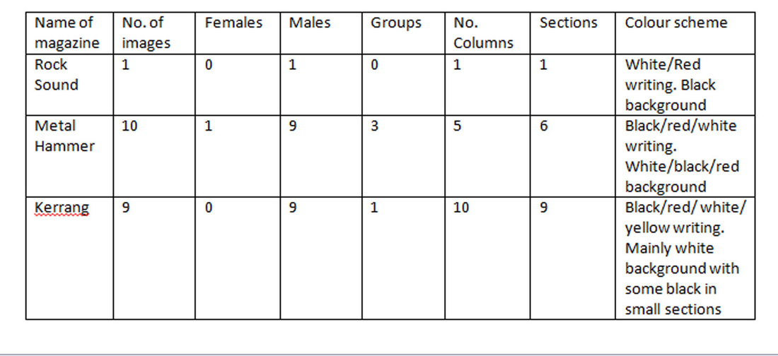
The Rock-Sound contents page is very plain with just one background picture, column and section placed on the right side of the page.While Kerrang & Metal hammer have 9 different images all over the page but no background image, they also have many sections while Rock-Sound only has one section ‘Main Section’. However their colour-scheme is very similar all using red, black and white this shows this could be the typical colour scheme for Rock magazines.
|
|
|
In my magazine I think I would use the same or similar colour scheme because clearly, it is the type of colours associated with Rock Magazines. I think that the black background is more effective to a white one because it has dark connotations that are usuall associated with metal, plus I think it looks better and allows the white/ red text to stand out more. I also feel that I should have at least 3 pictures on m contents page, I felt the Rock Sound contents page was a little bit bare, with only having 1 picture. However I felt that the other magazines with 9 pictures made the contents page look a little bit congested. So I would say 3-6 pictures depending on my articles of course.
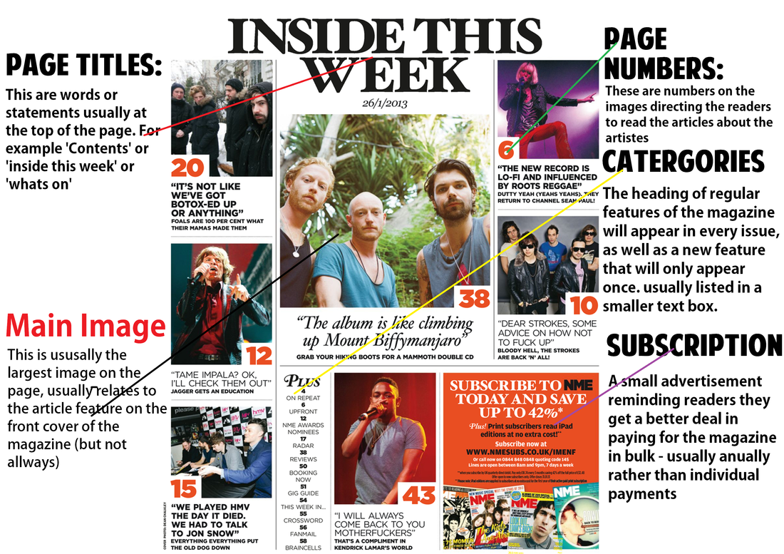
Conventions Diagram: Contents pages