My Skills Development
18th September 2013
Today I created this website using 'Weebly.com' Website Making thing. Iv never Made a website before so i learnt many new skills. One of these skills were creating the actual URL, it sounds really easy but i never realised that having '.com' will cost me $67.00, so I chose the wiser option of using '.weebly.com' instead. I also learnt how to make different Pages as well as linking them to their Headings / Sub Headings.
20th November 2013
Today I finished my audience research of The Publishing House 'Harris Publications Inc.' As well as wrote an overview of what Iv learnt from my audience research, my research was on 2 different front covers of magazines with a similar genre to the magazine I intend to make. I asked 5 of my friends 5 questions using Facebook and Blackberry Messenger and they stated their views on both covers. They also said how much they would expect to purchase a good quality magazine this also gave me a rough idea of how much my magazine should cost.
27th November 2013
Today I did a draft layout of a double-page spread. Since it was my first time I made loads of mistakes, my columns were un even, my masthead and other sections were not annotated. I plan to improve next lesson.
4th December 2013
Today I uploaded my draft ideas for my double-page spread, contents page and Cover page. I have chosen to go for the plain and simple double page spread with one image as the background and main image. I also used 4 columns instead of 3 because it seemed more dynamic. I fixed the majority of the mistakes from my last double-page spread especially with the un-even columns So I duplicated guidelines 3 times and placed it beside each other to ensure they are even.
11th December 2013
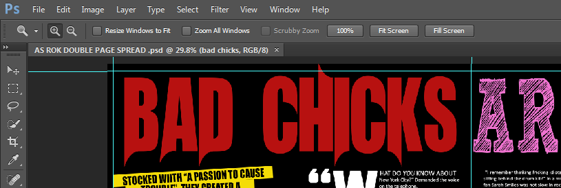
Today I continued my double page spread. I have decided the font for my head line I used the 'UnRealised' font because My band is called Absorbed Deuce and the title will say 'Bad chicks' and it had this devil sharp edge effect on the lettering which looking great in red. I downloaded this front from Dafont.com.
18th December 2013
Today I typed in the columns of texts I needed for the article, I used the Calibri font because I felt that it would be most effective font to use, this is because it looks professional yet it's not too formal. Having a formal font in a rock magazine is not very common, so I do not want to risk loosing my target audience by appearing too conventional. I found it easy to correct mistakes made in my drafted column content and adding to sentences that were unfinished. I am happy with the amount I've written as well with the quotes I chose from the "Interview" to be put above the image.
7th January 2014
All My Columns are complete. Also I can now confirm that the Images are with with my subjects standing in a black background making funny-cute faces for double page spread. I went with four images on the left side of the page because I didn't want it to feel over crowded with too many different pictures all over the page but I still wanted it to be filled. Also I added a link to the ROK Website at the end of my article, this was written in red because that will stand out against the black background as well as the rest of the white text. Leaving a link to the website is often done by many music magazine's - not just rock, adding this makes my magazine look a lot more professional.
21st January 2014
I worked on my double page spread over my free periods and I feel like its officially completed. Almost every piece of text were resized. My article text was reduced slightly, while my title was stretched across both pages letting the 'UnRealised' font show its 'demon' effect more clearly. Creating my double page spread helped me learn how to listen to advise/criticism while still maintaining my influence especially with the title. I noted many of the suggestions given by my peers and tried to implement them in my magazine. Of course not every suggestion was added but with the title, I tried it out and stuck with it because I agreed that it looked better with a larger and more stretched out font.
5th February 2014
I have continued with my Front page. I knew how effective using a grid is while creating my double page spread was, now I realised how essential it is when creating a front page. This is because I'm using a grid format for my Front page from my Magazine Idea's. Creating a Grid format is almost impossible without a Grid to guide you. I Learn't how to change the contrast of an image, this was really effective because my original image was slightly over exposed so lowering it made it look a lot more polished.
12th February 2014
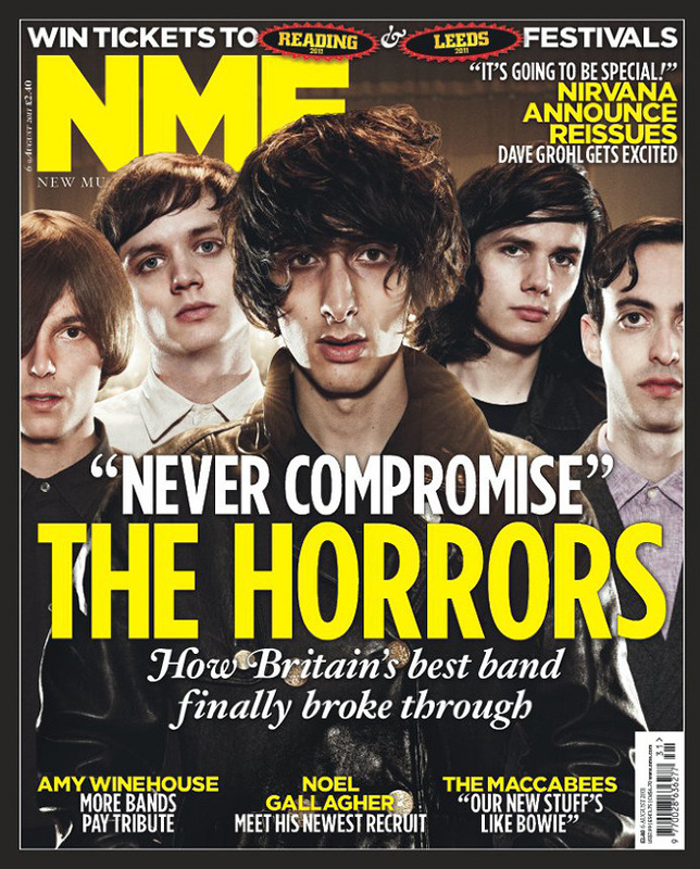
I learnt how to create a border for my images. In my front cover I didn't want a photo album effect like seen in Karrang because I feel tja it looks cheap, I prefer a simple singular image look, like seen in Nme magazine. Now I am looking at draft magazine coverlines
|
|
19th February 2014
I wanted to to create a list effect so like Q magzine I added a plus symbol and listed bands. I saw something in a Metal Hammer Magazine front cover, I felt it would look really great if I attempt it too. I also tried the word Manipulating tool on the cover lines, I made the words taller and thinner so that they could be more profession and ascetically pleasing!
27 th February 2014
I feel that my magazine front cover is finished. I decided to have one images of a close up of 'Jake Roberts'. I created a little advert with a grey sticker saying 'Oasis - 10 page exclusive' to attract readers to buy the magazine, as Oasis are legends in the rock arena I hope to attract my audience. I cropped a bar code from the internet and Placed it on the Bottom Right hand side of my Magazine because I wanted it out of the way of the readers but still visible for Shop Owners.
6th march 2014
I've just finished drawing out my magazine contents page layout. I will have 6 Images with one large image at the centre inspired by Real media texts. I will have an editors column on the bottom left had side, one column for the page numbers and information. I used the curves tool to change the lighting of both my images to make the quality improve.
13th march 2014
I Created a little advert for readers to Subscribe to a year of ROK magazine. I placed it at the Bottom right hand Side of the Contents page because that is what Kerrang NME magazines do, and I felt that it would effective to do the same. I tried to keep it simple since it was supposed to be our first issue, so I went for a text only advert like NME often does.
22th march 2014
I have finished my Contents page. I learnt how to create a background for writing page numbers. I simply write my text on the image, then I drew rectangles over the writing in burgundy red, then placed it behind the text using the layer tool. This allowed me to spread out my information from the centre column. And be creative by putting the page numbers on different sides on the contents page!
My Biggest Skill
My biggest/most important skill I developed was working with layers. When I started this academic year I really struggled with layers, but slowly I learn't to be really comfortable with them. In actual fact they are so simple, every thing you implement for example a picture creates a new layer, what the layer does is tell you if you want this picture to be above the text or behind the other picture. This was very essential when creating my magazine when it comes to putting text on top of an image before I even decided what image I wanted.
