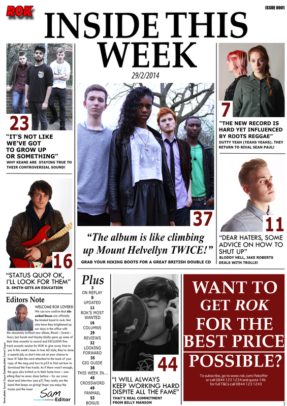
Post Production Survey - Contents Page
"I really like the layout of the magazine, its very simple easy to follow and very well made, you could tell a lot of thought went into this. The images are clear and well spaced out and I love how there are so many images to look at, usually magazines only have about 2-3 this went all out with 6 excluding the Advert and editors note
As much as I liked it I found the 'Inside this week' title thing a little bit boring almost like a newspaper - the same goes with the mini advert on the bottom right hand side, its just text on a white background, maybe it needed a few images of the magazine to show the 'Variety' of issues on offer"
-Belkis
"I like this contents page because of its simplicity, its engaging but most importantly efficient. The page numbers are nice and bold and with a wide variety of images with each artists' showing off different styles, attitudes and personalities. The advert is also simple and direct which I like.
But I am not very keen on the brightness of the centre image, I felt it was slightly too dark for me. Also I flet that the dateline did not need to be in italics, it kinda reduced the feel of the magazine. However I still this content remains visual, effective and sophisticated"
- Tracy
But I am not very keen on the brightness of the centre image, I felt it was slightly too dark for me. Also I flet that the dateline did not need to be in italics, it kinda reduced the feel of the magazine. However I still this content remains visual, effective and sophisticated"
- Tracy
"I found this contents page most refreshing because of its layout, well spread out across the page. Typically, you tend to see that one main image or two with a list on page numbers running down the side of it. This had a wide variety of pictures. I really like the pictures individually - all possessing different qualities and styles which makes this page far more engaging.
I felt that the advert should have images to make it more attractive but I get that they do tent to look quite tacky. I also felt that the page numbers were too big. I would have it smaller"
- Teni
I felt that the advert should have images to make it more attractive but I get that they do tent to look quite tacky. I also felt that the page numbers were too big. I would have it smaller"
- Teni
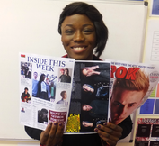
"Everything about this contents page seem to go perfectly for me. The layout is great easy to follow and does the job by giving me a lot of information about what different features are in the magazine this week. The page numbers were bold and big for those with sensitive. Also the title has a nice font told and sophisticated.
However I felt that the magazine lacked a bit of colour with the white background, if it was my magazine I would have added a red strip at the top of the contents page to add a bit more excitement to it. Also although the images were very engaging!"
- Bola
However I felt that the magazine lacked a bit of colour with the white background, if it was my magazine I would have added a red strip at the top of the contents page to add a bit more excitement to it. Also although the images were very engaging!"
- Bola
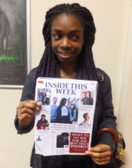
"I found the images were of good quality, well focused. I also the characters NVC - especially facial expression suited the 'rock theme'. I also liked how you used quotes rather than article title, it makes things refreshing! The big numbers make things easy to navigate.
However I did feel that the pictures were kinda repetitive, the image on the left to me looks really plane - his straight face makes him look almost to disinterested. I found the guitar far more interesting. Also the editors note didn't really suit the contents page, the font looks completely different and the text to me looks far too small"
- Anasthasia
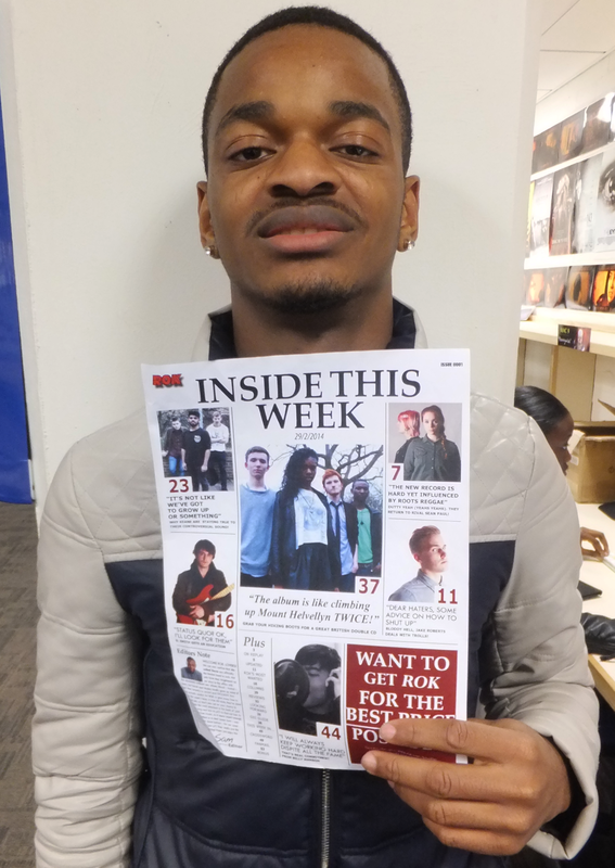
"I like the pictures especially the one of 'Jake Roberts' I think he looks very aggressive yet still cool, reminds me of something I would see in a real magazine. I also liked the editors note, I liked how you added the links to your twitter account, this made the magazine quite modern and adds the whole friendly yet professional touch.
I would like a brighter centre image, a bigger ROK logo on the top left and corner and for the advert to have a larger terms and conditions font for those with sight issues"
- Michael
I would like a brighter centre image, a bigger ROK logo on the top left and corner and for the advert to have a larger terms and conditions font for those with sight issues"
- Michael
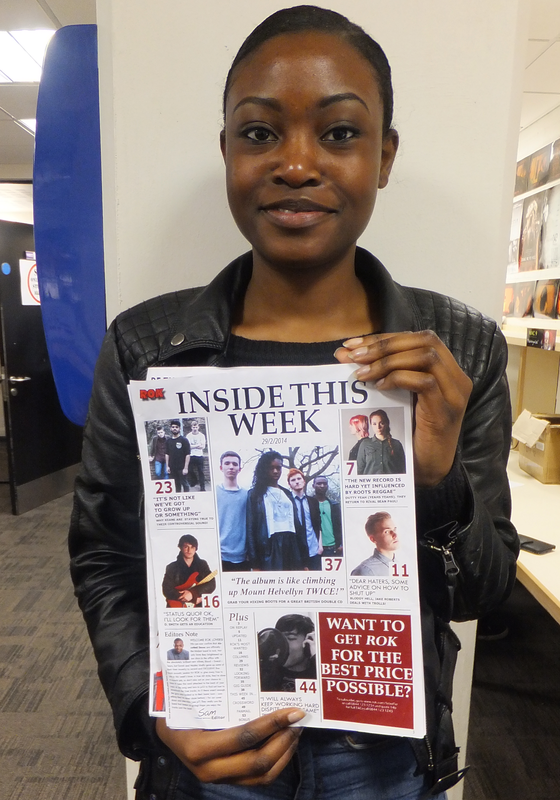
"I liked the 'Inside this week font - it looked profession slick and bold. I liked the ROK logo imprinted on the top left and the issue number on the top right, I felt that this was a good touch for collectors of the magazine. I liked how the page was laid out with large numbers which made things easy to follow.
I felt that the page number (NO.3 - BOTTOM RIGHT HAND CORNER - NOT TO BE CONFUSED WITH NORMAL PAGE NUMBERS) was too small. I would make things bigger. I would like a better advert, with images and less writing. I didn't like the image with the guy with the guitar I felt he looked too disinterested and stiff"
- Elizabeth
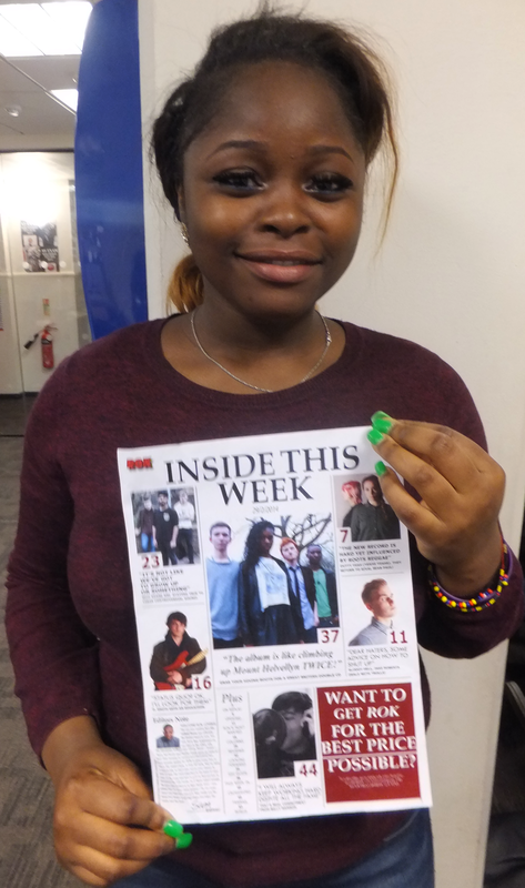
" I REALLY LIKED THIS PAGE because of the well placed and spread out layout. I liked how you didn't use too many bold fonts and all fonts used complimented each other and worked well with the great quality images.
I don't really have any real problems with this page but I would say I would like the ROK loo slightly bigger and the issue number and the logo should be swapped around with issue number - left and ROK logo - right"
- Abbie
I don't really have any real problems with this page but I would say I would like the ROK loo slightly bigger and the issue number and the logo should be swapped around with issue number - left and ROK logo - right"
- Abbie
Facebook response:
- Sakina
- Ray
- Riley
Evaluation conclusions: Things that worked well

Things that worked well:
- The wide range of images
- Page numbers are big and easy to follow
- Title font (Inside this week)
- Overall layout
- Editors note - social networks were a good a touch
Evaluation conclusions: Things that didn't work well

Things that didn't work well:
- The Subscription advert - just text = boring, pictures of different issues would have been a great touch
- Main image is slightly too dark
- 'D. Smith' looks too uninterested and ruins the feel of the page
- The 'to subscribe'/terms and conditions should be bigger
- ROK - should be at the top right corner and should be larger
- The issue number isn't needed
