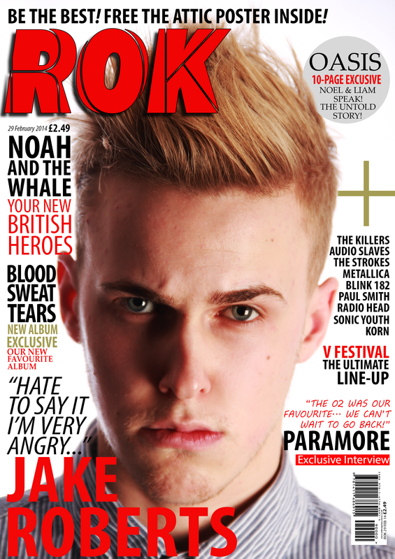
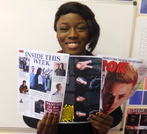
Post Production Survey - FRONT COVER
"I really liked the layout of the front page, it really suits the colour scheme of the magazine - Black and red, the white background adds a touch of professionalism, most of all the main image is very engaging and well edited.
There is nothing about this magazine I would change really... I find it at a very high quality, something I might find at my local newsagents. But if I had to be really picky, I would prefer the plus (symbol) to be written in words because I find that a little bit cheesy. But overall A really great front cover"
- Belkis
"This front page is great, everything just seems to fit so well together, like from the main image's costume (grey/blue) really goes well with the colour scheme, all the cover lines are placed in the correct areas. To me the Masthead is really different, something like this I haven't seen in a while, very well made with a striking main image.
However if I had to be pedantic I would say the sticker is slightly too big and I would have liked maybe another image to support the main image, although the main image is great another may be better, maybe instead of the sticker. It is still a very good front cover"
- Tracy
However if I had to be pedantic I would say the sticker is slightly too big and I would have liked maybe another image to support the main image, although the main image is great another may be better, maybe instead of the sticker. It is still a very good front cover"
- Tracy
I found the main image of the front cover as the stand out feature, it is well edited and very engaging with the direct address making you feel that the image may be almost daring you to pick it up! The masthead/log is also very nice and creative as well as easily recognizable/memorable. I just like the general feel about how the magazine is laid out, well arranged with good spacing between each of the cover lines, quotes and statements. However there are not too many cover lines to make the magazine seem flat.
Yet the main cover line doesn't seem to stand out as much to me, yes it stands out, yet to me I feel like it should stand out more since it is the main cover line. I hate to be picky but there is lightly too much of a gap on the top right hand corner - just above the sticker. A suggestion could be increasing the size of the sticker or maybe add another mini advertisement or something"
- Teni
"I love ROK'S edgy style with the main image's facial expression looking aggressive and dangerous, this is supported with a great masthead that is also nice and bold. Also the colour scheme screams classic rock with the use of use of Blacks, reds, greys and navy greens. I also liked how the cover lines are laid out, with good spacing and not too many white spaces, all of the space is well and evenly spaced out!
The Paramore quote on the bottom right hand corner to me breaks the classic rock style with the more 'youthful' - handwriting styled font kinda breaks the consistency. More over the main image looks slightly too dark on one side of his face. But overall the front page is really great"
- Bola
The Paramore quote on the bottom right hand corner to me breaks the classic rock style with the more 'youthful' - handwriting styled font kinda breaks the consistency. More over the main image looks slightly too dark on one side of his face. But overall the front page is really great"
- Bola
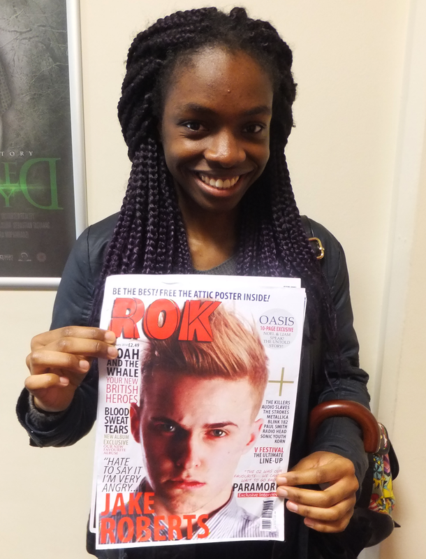
"I liked the typography used on the front page of this magazine, the masthead stands out and really works well with the rest of the fonts. The main image succeeded in keeping me attracted and engaged. I also felt the bar-code was well placed and and with lots of detail making it very professional.
I didn't really like the cross, it didn't come across as professional. I noticed that a parts of the image were slightly focused - to me a fully focused image is more engaging. The text above the Masthead to me wasn't needed and made the magazine slightly over crowded"
- Anasthasia
I didn't really like the cross, it didn't come across as professional. I noticed that a parts of the image were slightly focused - to me a fully focused image is more engaging. The text above the Masthead to me wasn't needed and made the magazine slightly over crowded"
- Anasthasia
"I liked the main image I found it well edited and engaging, his hair really stands out on this page. I also think the layout worked well with the typography.
I really liked this page but I felt that there were too many cover lines, I would use less to have the slick minimalist theme because of the great image! I didn't like the sticker I found it a little basic, a stamp has more aggression. If I could change anything else , I would increase the price tag size to attract the audience because of our low prices"
- Micheal
"I like the layout of the magazine, the cover lines are well placed (with few white spaces). I also really liked the colour scheme, I feel that all the colours complimented each other. The main image is nice, he looks very aggressive which is eye catching and interesting.
I felt that the plus sign/symbol could be thinner. Also to me the main cover line/quote font should be a different font, maybe one more classic serif"
- Elizabeth
I felt that the plus sign/symbol could be thinner. Also to me the main cover line/quote font should be a different font, maybe one more classic serif"
- Elizabeth
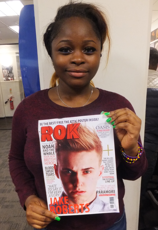
"I liked the selling line well I felt it was simple yet effective 'Be The Best'. The main image is great and so is the masthead and the overall layout and overall slick theme of the magazine.
I didn't like the main cover line, I felt that it was slightly too big, I thing the Masthead should be the biggest thing on the front page so I would reduce that. Also I don't think that the cove line - quote should be in italics, regular font would be better. Also I think that the Sticker should be slightly slanted to make things more interesting"
- Abbie
Facebook responses:
- Sakina
- Ray
- Riley
Evaluation results: Things that worked well
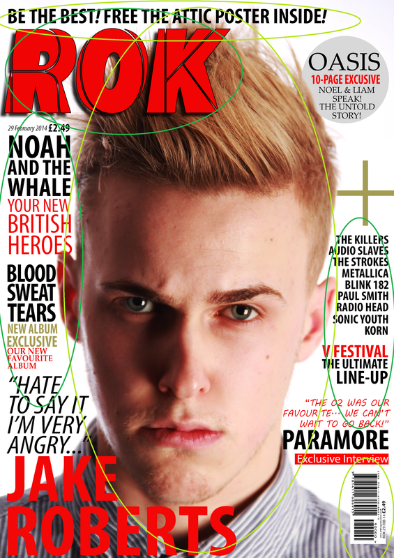
The main things that worked well:
- Masthead/Log
- Cover lines - placement + fonts
- Main Image - facial expression/direct address/editing/image quality
- Selling line/advert
- Barcode
Evaluation results: Things that could improve

Things that didn't work well:
- The depth of field effect around the main image
- The Main coverline font/caption
- The Paramore quote - font
- Plus symbol - too thick/should be in words
- Top right hand colour - too much space - add a picture or bigger sticker
